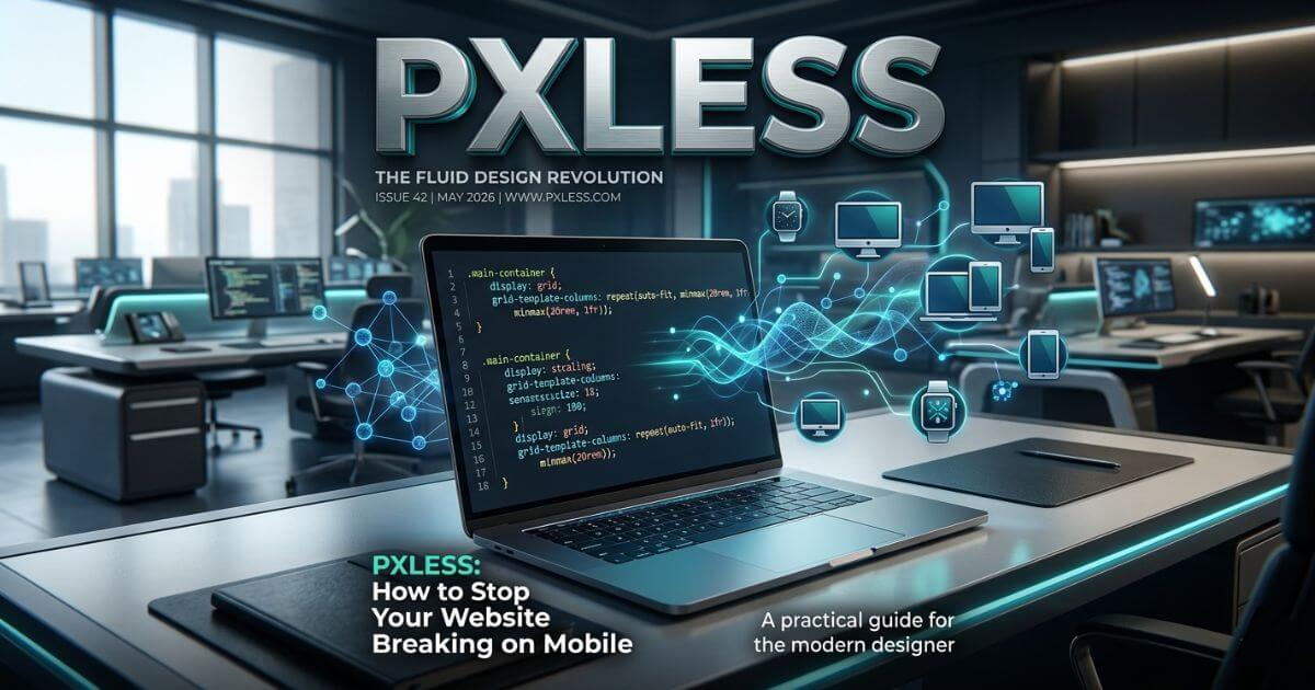
Is your website beautiful on a computer but messy on a phone? Many websites look perfect on a big screen but break on mobile. Text overlaps, buttons become too small to tap, and users get frustrated. This leads to unhappy visitors and lost sales.
A pxless design is the modern solution. It uses fluid units instead of fixed pixels so your site can flow perfectly on any screen size, zoom level, or device.
Instead of setting exact sizes in pixels, pxless design uses simple math. This lets the browser decide the best fit for every user. This guide shows you easy steps, real code examples, and clear methods to build a site that never breaks.
Why Most Websites Still Break on Phones
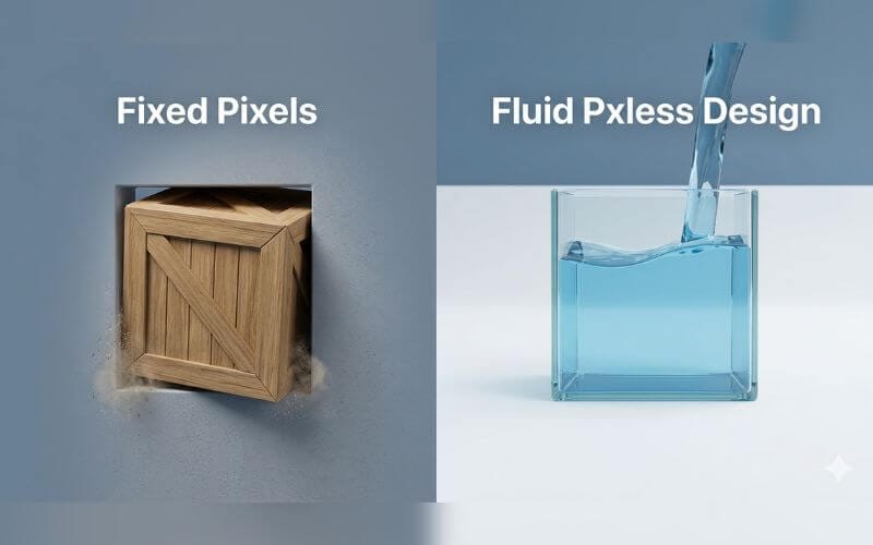
Websites break when they are too stiff to change. Imagine trying to fit a large wooden box into a small backpack. It simply won’t fit unless the box can shrink.
Common Mobile Problems (Zoom, Foldables, Ultra-wide)
Modern screens come in thousands of shapes. Some phones are long and thin. New foldable phones even change shape while you use them. A fixed-pixel layout cannot handle this variety. It either stays too big and forces side-scrolling, or it stays too small and leaves ugly gaps. When users zoom in to read better, fixed pixels stay frozen, causing words to crash into images or get cut off.
The Real Cost of Fixed Pixels
Fixing broken layouts for every new phone is a never-ending job. Engineering teams often spend a large part of their time just patching CSS for different screens. This makes the code heavy and slow. It wastes time, increases costs, and frustrates both developers and business owners.
Evidence of Broken Experiences
Research shows that more than half of mobile users leave a site if it feels broken or takes too long to load. Common failures include:
- Side-scrolling that forces users to slide left and right to read one sentence.
- Crowded buttons that make it hard to tap the right one.
- Hidden text that gets covered by images because it was locked in a fixed spot.
What Pxless Actually Is (Simple Explanation)
Pxless design is a method of building websites where every size is a percentage or a flexible unit. Think of it like building with rubber bands instead of stiff wooden sticks. The site can stretch or shrink naturally to fit any screen.
Pxless vs Traditional Pixel Design
| Feature | Traditional Pixel Design | Pxless Design |
| Main Unit | Fixed Pixels (px) | Relative Units (rem, %) |
| User Choice | Ignores browser settings | Respects user font settings |
| Maintenance | High (fix every screen) | Low (one code fits all) |
| Accessibility | Hard to read when zoomed | Perfect for everyone |
| Search Ranking | Risk of mobile penalty | High mobile-friendly score |
The Move to Fluid Standards
In today’s digital world, there is no single “standard” screen size. Pxless became the latest standard because it gives control back to the user’s device. Instead of forcing a size, the code asks, “How much space do we have?” and adjusts instantly.
Core Rules of Pxless Design
To master this style, you must learn to think about how elements relate to each other rather than using exact numbers.
3 Most Important Rules (With Copy-Paste Code)
- Set a Flexible Root: Let the browser decide the base size so it respects user needs.
- Use rem for Typography: This ensures text grows or shrinks based on the user’s settings.
- Set Maximum Limits: Use max-width so your site doesn’t look stretched on giant screens.
CSS
html {
  font-size: 100%; /* Default browser size (usually 16px) */
}

.main-box {
  width: 90%;
  max-width: 70rem; /* Keeps layout comfortable on large screens */
  margin: 0 auto;
}
Fluid Typography and Spacing Made Easy
Fluid typography means your headings change size smoothly as the screen gets bigger. The clamp() function is a brilliant tool for this. It acts like a smart guard that tells your text: “You can grow, but stay between these two sizes.”
Best Units to Use Instead of px
- rem (Root em): Best for all text. It scales with the user’s browser choice.
- vw (Viewport Width): 1vw is 1% of the screen width. Great for big background images.
- %: Perfect for making side-by-side columns that shrink together.
- ch: Based on the width of a character. It helps keep reading lines comfortable.
How to Switch to Pxless in Real Projects
You can start using these methods on a small part of your current site today.
5-Step Beginner Method
- Find the Pixels: Search your CSS for any px used for font sizes or widths.
- The Divide-by-16 Rule: Take your pixel number and divide by 16 to get the rem value (Example: 32px / 16 = 2rem).
- Change Widths: Replace width: 800px with max-width: 50rem.
- Update Spacing: Use rem for the gaps between boxes so the whole page breathes together.
- The Drag Test: Grab the corner of your browser window and move it. Everything should move smoothly like water.
Before vs After Code Examples
Old (Stiff):
CSS
.card {
  width: 400px;
  padding: 20px;
}
New (Fluid):
CSS
.card {
  width: 100%;
  max-width: 25rem;
  padding: 1.25rem;
}
Quick Wins for Today
Change your main container to width: 90% and max-width: 60rem. This single change removes side-scroll problems on almost every phone.
Converting Old Websites to Pxless
You don’t need to throw away your old site. You can update it section by section.
Complete Migration Checklist
- Set your base font size to 100% in your main CSS file.
- Convert all main headings (H1, H2) to rem or clamp().
- Make all images flexible by setting max-width: 100% and height: auto.
- Swap fixed padding in buttons for em units so buttons grow with the words inside.
- Test your site at 400% zoom to ensure nothing overlaps.
Realistic Effort & Results
Converting a standard 5-page site takes about one full day of focused work. This small task can save a business thousands of dollars because you won’t need a total redesign every time a new phone is released.
Pxless for Better Speed, Accessibility & SEO
A website that is easy to use is a website that search engines want to show to people.
How It Improves Loading Speed
When you use fluid units, you need fewer extra lines of code to fix mobile bugs. A smaller CSS file means the browser can load and show your page faster. This helps your Core Web Vitals score.
Accessibility: Helping Everyone
Some people have trouble seeing small text and need to zoom in. Pxless design ensures your site stays organized when they do. Fixed pixels ignore these users, which is not only unkind but can also lead to legal complaints in some countries.
Simple Tests You Can Do Yourself
The “Zoom Test” is your best friend. Press Ctrl and + on your keyboard until the zoom hits 400%. If your site turns into a single, easy-to-read column without any words getting cut off, you have won!
Tools, AI & Future of Pxless
Modern technology is making it much easier to leave pixels behind forever.
Best Free Tools
- Unit Converters: Online tools that do the math for you.
- Fluid Type Generators: Websites that create the clamp() code for you.
- Browser Inspector: Use the “Mobile View” in your browser to test different phones.
How AI Tools Help
Modern AI coding assistants are now trained to use fluid units by default. If you ask an AI to build a modern responsive header, it will usually use rem and flexbox because those are the highest professional standards today.
New Features (Container Queries)
A new tool called Container Queries is joining the pxless family. It allows a box to change its style based on how much room is in its parent box, not just the whole screen. This makes your design even smarter.
Also Read: WatchNewMovieNet Com 2026: Is It Safe or Just a Waste of Time?
Common Mistakes & Smart Tips
Even the best developers can make small mistakes when starting out.
Top Mistakes to Avoid
- The “No-Limit” Trap: If you don’t use max-width, your site might look too stretched on a giant monitor.
- Mixing Units: Try to stick to a simple system. Using too many different units can make your code confusing.
- Forgetting the Root: Always make sure your base font size is set to 100% first.
The 1px Secret (Hybrid Approach)
Here is a useful tip: Keep your borders at 1px. For very thin lines, pixels are still the best. If you try to make a tiny border fluid, it might look blurry or invisible on some screens. Use pxless for everything else, but keep your borders sharp with 1px.
Frequently Asked Questions About Pxless
Does this change how my site looks?
No. It looks exactly as you designed it, but it becomes much smarter at fitting onto different screens.
Will it work on WordPress or Shopify?
Yes. Most modern WordPress themes and Shopify builders now allow you to use rem and % instead of pixels in their settings.
Can I use pxless with Tailwind CSS?
Absolutely. Tailwind uses rem units by default for almost everything, making it a great tool for pxless design.
Does pxless hurt website performance?
Actually, it helps. By removing the need for many extra fixes, your file size gets smaller and the site loads faster.
Key Takeaways & Your Action Plan
Fluid design is the only way to build a website that truly works for everyone.
Summary
Fixed pixels are too stiff for the modern web. By using relative units like rem and clamp(), you create a website that is fast, easy to read, and ready for any device.
7-Day Practical Action Plan
- Day 1: Test your site at 400% zoom and see where it breaks.
- Day 2: Update your base CSS font size to 100%.
- Day 3: Convert your main headings and text to rem.
- Day 4: Swap your fixed widths for max-width.
- Day 5: Use clamp() for your biggest titles.
- Day 6: Test on a real phone and a tablet.
- Day 7: Celebrate your unbreakable, fluid website!
Final Expert Tip
Stop thinking about “iPhone sizes” or “Desktop sizes.” Start thinking about your content. If the content has room to move, it will always look good on any device.
Discalimer: This guide is for learning purposes only. We share tips and code to help you build better websites. However, every website is different. We cannot promise that these steps will work perfectly for your specific site. Please save a backup of your code before making changes. We are not responsible for any errors or data loss that may happen while following this guide.
You May Also Like: Lititz Springs Park Events Restrictions 2026: What’s Allowed, What’s Banned & How to Host a Small Gathering
Hi, I’m Emma Rose, the creative heart of Punstation.com. With a background in crafting hundreds of engaging guides and clever wordplay, I specialize in making complex information easy and fun to digest. Whether I’m diving into technical trends, lifestyle hacks, or my signature witty puns, my goal is to provide high-quality, research-backed content that solves problems and brings a smile to your face. For me, every topic—from tech to humor—is an opportunity to share clear, expert insights with a fresh perspective.